Those familiar with some of the basic elements of technical price analysis have probably used candlestick charts in some of their market analysis and this is generally because these charts help you to make broad assessments with just a quick glance. But one under-utilized aspect of these charts can be seen in the candle formations, which can give strong indications of how prices are likely to move in the future.
This can be highly valuable information for binary options trades, as candlestick patterns can give a great deal of information when forecasting price direction. This is critical for knowing when a trader should enter into a CALL or a PUT, so here we will look at some of the ways candlesticks are interpreted and at some of the most commonly used patterns so that these signals can be used in trading.
Candlestick Binary Options
Candlestick charts are highly valuable for spotting reversals in trends and entry/exit points for new trades. But how can we interpret the information given by these charts? First we must understand the anatomy of the candle.
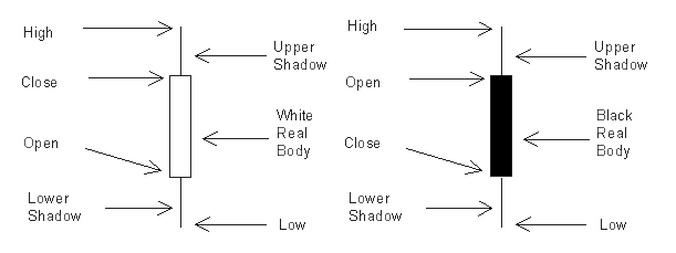
Candlesticks are comprised of information explaining the High, Low, Open and Close for the given time period. The high is shown at the upper end of the top shadow, while the low is seen at the end of the bottom shadow. The body shows the difference between the open and close of the period, and different colors will be used depending on whether or not the opening price was higher than the closing price. This can be seen in the graphics below:
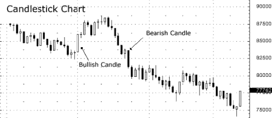
Next, we look at the candlestick chart as a whole to see how these candles fit into the larger picture:
Long Bodies and Short Bodies
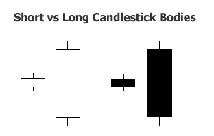
Looking at the size of the candle body can also give traders important information about potential price direction. Short candle bodies indicate restricted price movement and consolidation. Conversely, longer bodies suggest stronger buying and selling pressure. Long wicks attached to these bodies suggest higher levels of volatility.
The Hanging Man and Hammer Patterns
Now that we understand how to interpret these charts, we will now look at ways to spot potential reversals in price (which is key for constructing binary options trade ideas). The most common patterns in this category are the Hammer and Hanging Man patterns, and we can see examples in the graphics below:
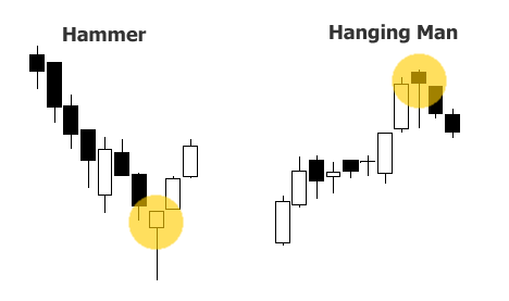
When prices are showing a strong downtrend, traders can look for bullish trading opportunities once a Hammer formation becomes apparent. The logic behind this approach comes from the fact that prices are already at extreme lows but markets have snapped back (evidenced by the long lower Hammer wick). This pattern marks a potential turning point and a good opportunity to enter into new CALL positions for the asset.
Conversely, when prices are showing a strong uptrend, traders can look for bearish trading opportunities once a Hanging Man formation becomes apparent. The logic behind this approach comes from the fact that prices are already at extreme highs (too expensive) but markets have failed after reaching these heights (evidenced by volatility of the long upper wick). This pattern marks a potential turning point and a good opportunity to enter into new PUT positions for the asset.
Engulfing Patterns
The next candlestick reversal patterns we will look at are the Engulfing patterns (bullish and bearish). These are shown in the graphic below:
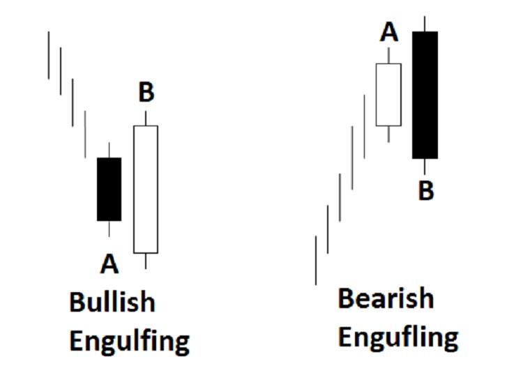
Bearish Engulfing patterns often become apparent when prices are showing a strong uptrend, and bearish trading opportunities can be taken on the expectation of a downside reversal. The logic behind this approach comes from the fact that the previously bullish sentiment is now being “overshadowed” by bearish momentum, and prices are likely to continue lower. When these patterns are seen, traders can enter into PUT options based on these expectations.
Bullish Engulfing patterns often become apparent when prices are showing a strong downtrend, and bullish trading opportunities can be taken on the expectation of a upside reversal. The logic behind this approach comes from the fact that the previously bearish sentiment is overextended and is being overcome by bullish momentum. Since prices are likely to continue to move higher, traders can look to establish CALL options when these patterns become apparent.
Using Candle Stick Patterns to Spot Price Reversals
From the examples above, we can see that chart candlestick patterns can provide a way to determine potential reversals in prices. This information can be critical when looking to establish a trading bias using binary options. When prices are showing a strong downtrend, a bullish reversal candle can help to create solid opportunities for CALL options. When prices are showing a strong uptrend, a bearish reversal pattern can be a good indication that the rally is over and that traders should consider PUT options.
Bullish Homing Pigeon Candlestick
The bullish homing pigeon is a bullish indicator, and consists of candlestick chart patterns. It is an indicator that you will use to initiate a call binary option, as it is typically an indicator that a bearish trend is about to reverse itself. Here, we will go over the basics that you need to know before you start using this pattern in your own trading, and what things you should be looking out for in order to avoid incorrect trades.
First, this is a candlestick chart pattern, consisting of just two subsequent markings. The first is a large downward trending candlestick. The second is also downward trending, but is completely engulfed by the first. All of the second, including the high and low points, fit within the trading body as indicated by the first marking.
It is a bullish signal, which means you should only use call options when this pattern appears at the bottom of the chart. This is all downward trending behavior, but if you look deeper into it, it indicates a change in trader sentiment for the better. The second marking opens higher than the first closed, and it closes higher than the first closed, too. The low point for the session is higher than the closing of the first as well. This means that although the asset is still trending downward, it is losing momentum and is very likely to pick up steam in the coming sessions.
When you begin looking at your binary options strategy for this, keep in mind that it might take a few sessions for this anticipated behavior to manifest itself properly. If you are looking at 60 second markings, that means you may need to extrapolate out as far as 15 minutes to get the right expiry for your trades. You never want to go shorter in timeframe than 5 minutes for this. Even that might be too short in some instances. Your goal should be to focus at a range of 10 to 15 minutes before expiry, so having some ability to customize this feature in your trades will be helpful to you.
Because the first session is downward in such a strong fashion, and the second is so weak, there is a good chance that the technical indicators, such as MACD, will reflect this behavior, too. Thanks to this, this is a fairly reliable indicator, even though it is strictly a visual one when limited in this manner.
The bullish homing pigeon trading strategy is a visual method of interpreting price movement, and therefore has flaws. It is one of the most reliable visual indicators, though, which leads to its popularity. Still, your best shot when it comes to reducing the likelihood of error is to check MACD before you initiate a trade. MACD is a good indicator when it comes to anticipating price reversals, and works perfectly with this particular visual interpretation.
You may also find that you should check fundamental indicators to get an idea of how much you should risk per trade. If this is found at the bottom of a chart, but that trend is only a micro trend and the overall movement of the asset is still downward, you will see some success, but not as much as if the trend were already overall bullish and the downward trend that must exist for this to occur is a micro one. If the overall direction is not already upward, and you are working within a micro downward trend, your success rate will not be as nice as you might like it to be.
Bullish Abandoned Baby Candlestick
Despite the overt morbidity of the name of this strategy, it is a fairly popular strategy to use for establishing call option position when it comes to binary options trading. It is also a very easy to use tool when it comes to quickly analyzing potential positions and finding just the right entry point. Let’s look at how to use this trading strategy, and what you should look out for when using it.
First, the bullish abandoned baby is a pattern that we are looking for while using candlestick charts. It is called by this name because the telltale pattern consists of two large candlesticks with a small candlestick between them, yet far below. It gives the impression that the two larger candlesticks have abandoned the tiny one as they go up in price.
The pattern consists of three individual candlesticks. The first is a downward trending one, and typically consists of a large range of prices, with a high opening, and a low closing. The next is also a downward trending one, but has a very tiny range, with the opening and closing near the body of the session. This is going to need to have both opened and closed below the lowermost wick of the previous candlestick. The final one is upward trending, and the opening is well above the entirety of the “baby.” The closing should be much higher, and this should be indicative that an upward trend is underway, giving you cause to initiate your call option.
When you see this pattern, it is an indication that prices are going to rebound. You should initiate a call option here that is relative to the candlesticks that you are using. Like many other candlestick methods, you need to give yourself enough time before the expiry so that the markets can react to the information that you have, but not as much as you typically would. One of the nice things about this method is that it marks that a price reversal has already begun to occur. If you are looking at one minute candlesticks, then a 1 to 5 minute call option is correct. There is a danger in going out too far beyond this because of the fact that the trend has already begun, and if it is a false indicator, the psychological impact that it has on short term traders will fizzle out before the trade expires. In this respect, it is a better tool for ultrashort term traders than many other visual indicators out there, although, as you will see, it is not perfect.
Like other visual indicators, the bullish abandoned baby is flawed in that it doesn’t measure the asset’s movement or strength directly, but instead looks to the patterns that this movement creates. It’s still a strong indicator because the visual data left behind is based upon those things, but it’s not a direct representation, and as a result of this, there can be discrepancies in how the asset will move afterward. Because this is linked to actual information, and because it is a well-known indicator, there is a psychological impact upon traders that see this pattern, which can lead to the desired result anyway.
Do be careful about timing your trades with this. When using binary options, it is important that this pattern be at the bottom of the chart, as close to the support line as possible. If your expiry is out too far, you may also lose money, even if you are correct in your interpretation of things. The more experience you have with using candlestick charts in your binary trading, the less of a problem this will become.